Create a Calm Home: The Ultimate Neutral Color Palette Guide
janvier 29, 2025 | by Clémence Burlot
Discover how to create a serene living space with our comprehensive neutral color palette guide. Learn expert tips for combining warm and cool tones for a timeless, peaceful home.
Creating a serene and timeless home environment starts with choosing the right colors. A well-executed neutral color palette can transform your living space into a peaceful sanctuary while providing the perfect backdrop for your personal style to shine. In this comprehensive guide, we’ll explore how to master the art of neutral colors to create a harmonious home that stands the test of time.
Understanding Neutral Colors
Before diving into specific color combinations, it’s essential to understand what makes a color truly neutral. Neutral colors are those that don’t compete with other colors and instead create a balanced foundation. These include various shades of white, beige, gray, and even muted earth tones1. However, contrary to popular belief, neutral doesn’t mean boring.
The Foundation: Choosing Your Base Color
The first step in creating your neutral palette is selecting a base color. This will be the dominant color in your space, typically covering the largest surfaces like walls2. When selecting your base, consider these options:
- Warm whites create an inviting atmosphere and work particularly well in north-facing rooms that receive cooler light. Think colors like Benjamin Moore’s White Dove or Sherwin-Williams’s Alabaster.
- Cool grays offer a modern feel while maintaining sophistication. Popular choices include Agreeable Gray by Sherwin-Williams or Repose Gray, which provide depth without feeling heavy.
- Soft beiges bring warmth and versatility to any space. Look for options like Accessible Beige or Natural Linen for a timeless foundation.
Building Your Color Story
Once you’ve established your base, it’s crucial to layer in complementary neutrals. The key to a successful neutral palette lies in combining warm and cool tones while maintaining a cohesive look. Furthermore, incorporating different textures becomes essential when working with a limited color range3.
Primary Support Colors
Choose two to three supporting colors that complement your base. For instance, if you’ve selected a warm white as your primary color, consider:
- A light greige (gray-beige) for subtle contrast
- A deeper taupe for architectural details
- A soft cream for transitional areas
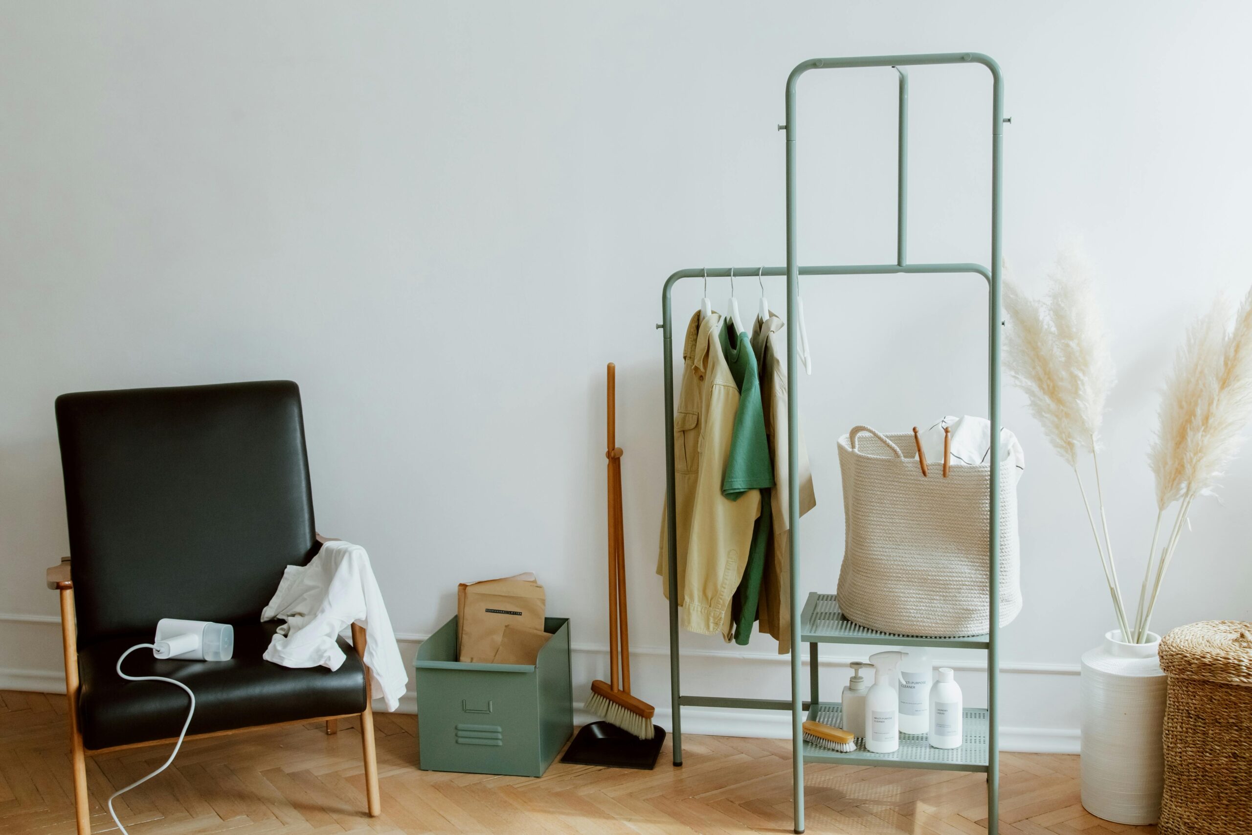
Adding Depth Through Texture
To prevent your neutral space from falling flat, texture becomes your best friend. Moreover, incorporating various materials adds visual interest without disrupting your calm color scheme. Consider these elements:
- Natural fibers like jute, wool, and linen
- Woven textiles with subtle patterns
- Brushed metals and weathered woods
- Textured wallpapers in tone-on-tone patterns
Read more about Hygge and Minimalism: The perfect balance for modern homes
The 60-30-10 Rule
Successfully implementing a neutral palette requires understanding proper color distribution5. The classic 60-30-10 rule applies even when working with neutrals:
- 60% should be your base color (walls, large furniture pieces)
- 30% should be your secondary color (accent furniture, textiles)
- 10% should be your accent color (accessories, artwork)
Common Mistakes to Avoid
When creating your neutral palette, be mindful of these potential pitfalls:
First, avoid choosing colors that are too similar in value, as this can make a space feel flat and uninteresting. Additionally, don’t forget to test your colors in different lighting conditions, as neutrals can shift dramatically from day to night.
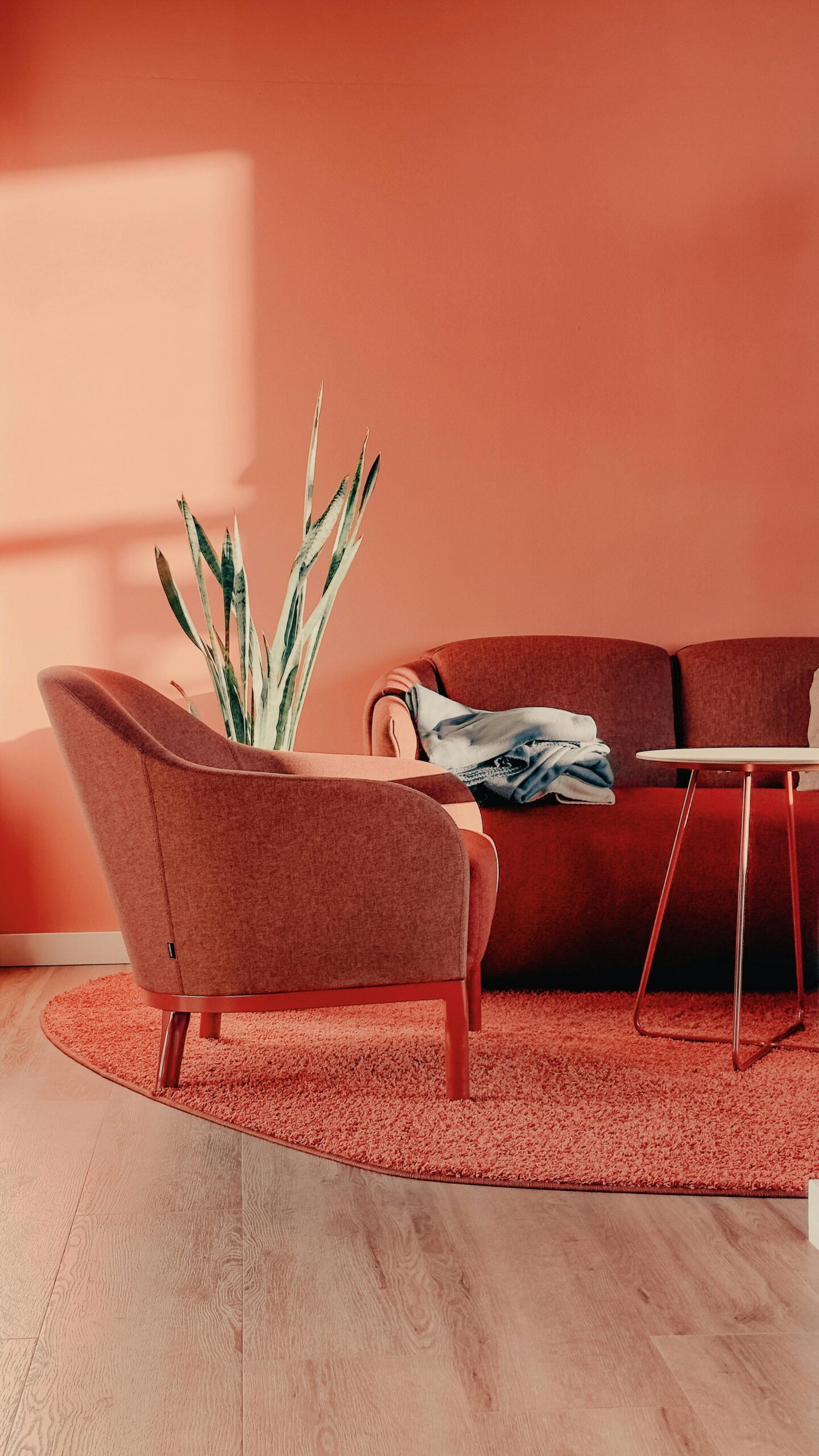
Bringing It All Together
The final step in creating your calm, neutral home is to coordinate your choices throughout your space. [internal link: open floor plan decorating] Consider these tips for a cohesive look:
- Use darker versions of your neutral palette in anchor pieces like sofas or area rugs
- Incorporate metallic accents for subtle glamour
- Add natural elements like plants to bring life to your neutral space
- Layer different shades of the same neutral for depth
Maintaining Visual Interest
While neutrals provide a calming backdrop, it’s important to maintain visual interest5. Consider these strategies:
- Incorporate patterns in neutral tones
- Use contrasting textures
- Add architectural elements like wainscoting or crown molding
- Include black accents for grounding
Conclusion
Creating a calm home with neutrals is about more than just picking safe colors. It’s about understanding how different tones work together, incorporating texture, and maintaining visual interest while creating a peaceful atmosphere. By following these guidelines and paying attention to the details, you can create a sophisticated, timeless space that provides the perfect backdrop for your life.
Reference :
- The Ultimate Guide to Using Neutral Colors in Your Home Decor – Tommy Franks
- 8 Neutral Color Palettes Designers Swear By – Decorilla
- How to Mix Warm & Cool Colours in Your Home Decor – Provincial Home Living
- Mixing warm and cool colors is the new shortcut to an on-trend palette – here’s how interior designers do it – Living Etc
- Mixing cool and warm elements in architectural spaces – LBF
Keywords: neutral color palette, calm home, interior design, color theory, warm neutrals, cool neutrals, texture in design, neutral paint colors, serene living space, timeless design, home decor, color coordination, neutral home design
RELATED POSTS
View all
9 Rules for Decluttering Without Losing Your Home’s Soul
janvier 16, 2025 | by Clémence Burlot

Hygge and Minimalism: The Perfect Balance for Modern Homes
janvier 18, 2025 | by Clémence Burlot
Master the Art of Warm Minimalism: Where Cozy Meets Clean
janvier 15, 2025 | by Clémence Burlot